Pages

Sunday, February 26, 2012

Cornwell Studies

I'm still working on the sketch for the samurai vs. dragon painting from last week. The picture has a lot going on in it, but is basically broken into a dark, cool foreground and a sunlit middleground. I've seen tons of Dean Cornwell paintings masterfully pull of this arrangement, so I did some comp studies from him to try to figure out how to pull it off.


This painting has a lot going on in it. Several figures, bright primary colors, and (at first glance) a seemingly chaotic value pattern. The value study quickly shows how simply all the masses are arranged, though.


Howard Pyle and Harvey Dunn taught their students to compose using, at most, 3 values. Dark, Middletone (for the lights in the shadow, and the shadows in the light), and Light. You can see that at work here. The foreground figures are all in shadow, and clustered into one dark shape. The second cluster is in middletone, and the background is mostly light, with the other values used to create pattern.


The study in color shows how carefully Cornwell controlled the use of his 3 values. The light areas of the foreground figures are all done in middletone, never the light tone. To use that would break the shape and value pattern of the whole image. The lights on the middleground figures are done in the light tone. There is no dark tone used on that shape.


One thing that surprised me while doing these is how well the picture works in grayscale. I'd assumed that the color was much more important to helping it read.


Just drew on top of the image to see where things line up. The major shapes pointing to the main figure, who is dark and silhouetted against the light yellow drapery, are obvious. The diagonals fanning out in the second image was less expected, although I suspect that I'm just finding patterns there. I couldn't say whether it's critical to the image or not.


It's also important, while looking for patterns like this, to keep in mind that they're design aids. "Composition" includes many things, and design- the arrangement of shapes- is only one of them. That they are often mistakenly assumed to be the same thing, I feel, leads a lot of people to think that the design of a piece is all that's needed to make it work, thus you have so many magic bullet composition schemes being peddled. I'll rant about that another time.


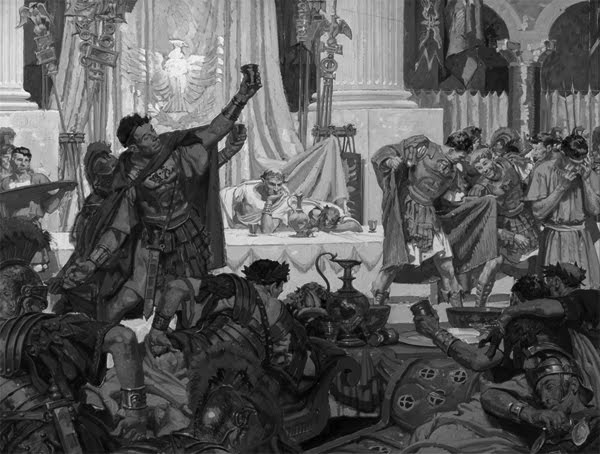
This second painting is much simpler, and uses the same device of dropping the foreground in shadow. The foreground uses the dark and middletones. The two main characters are in full value range, however. They're the main actors in this, so it makes sense- the main figure in the previous painting is the focal point, but the story doesn't revolve around him. In this picture, we have full light against dark contrast on the main figures, and they're framed and silhouetted by the dark background and white pillars, focusing all attention on them.


I went back to my own sketch after doing these, and focused only on value this time. This is one of those things that I've been taught for years, but for some reason keep trying to skip- compose in value. If it works in value, it will work in color. I tried to arrange the values more carefully, and used a full range on the main rider. Hopefully it reads better now.

Monday, February 20, 2012

Composition Studies - Battle Scenes

Until now I've mostly been using this blog to dump new work as I make it, so it's tended to get neglected. I'm going to try to make a point of doing regular updates from now on, and will focus on my studies of composition and picture-making. I paint a lot of pictures with multiple figures and action, and want to try to pick apart how others have approached that- using shape language, pose, the overall graphic design of the picture, and generally the spirit of the thing.

The painting that I've been doing studies for is a rather complicated battle scene, of a bunch of mounted samurai being attacked by a dragon. The 2 sketches I ended up choosing between are-


Both of the 2 have merits. In particular, I like the more unified shapes in the second, but I'll be going with the first one. There's a little more immediacy to what's happening, as opposed to the second, where the danger is already upon them and passing. The first also has more of the look of screeching to a halt, like they've just been set upon, which is what I originally wanted. The focal point is clearer and the camera angle's more interesting.

Still, there are problems. The shape language needs to be better. That main horse in particular looks too calm, and I'm not sure how to lend more urgency to the movement. I decided to do some comp studies of older battle scenes and found even more that I don't like in my picture- the large, split, symmetrical shape of the two horses in the foreground, for one. There's little unity, it's too haphazard.


This is one of my favorite battle scenes by Howard Pyle. He was a master at capturing the spirit of a scene, and his sense of design was incredible. Even though there's a lot going on, there are really 2 large masses in the picture- that of the horses and the un-mounted soldiers, separated by the barrier of that rifle.


The large mass of the attacking horsemen drives a wedge into the foreground. Simple but very effective shape language.


Note the implied lines in the attacking shapes. The arms and swords silhouetted against the sky in particular give a real sense of those guys bearing down on that thin, opposing diagonal of the rifle, which is all that stands between them and the infantry. This is the kind of thing I want to be able to do in my own pictures- the shapes, the lines, the brushstrokes, they all communicate the idea before you even have a chance to analyze everything.


This was actually pointed out to me months ago by another artist. Not so much about the shape language, just more showing how Pyle controlled the focal area. Tons of implied lines point to the central horseman, who is also silhouetted against the light sky.


Same thing, in case you like spirals.


Here's another, even more complicated Pyle battle scene. This one is a mural that he did. Countless figures in all manner of poses, but...


...they're all grouped into large shapes, all of which are designed to convey the forward thrust of these charging soldiers.


Implied vectors within the shapes further carry the thrust. I don't even need to draw the lines over the light rifles that do the same, those are obvious. Another thing to take away from this picture- if some art student ever looks at your picture as says, without really looking, "I don't like how this line leads my eye out of the picture," please hit him. You can do the same if someone starts talking about the rule of the thirds.


Here's a Frederick Remington piece. This one's harder for me to figure out, but I wanted to get what I could about the shape language of the horses. The silhouettes of almost all of them are top-heavy triangles. This gives the impression of being off-balance, which conveys motion. Even when you walk slowly, from one step to the next, there's that brief moment when you're off balance.


Same thing, only applied to the larger masses and cast shadows.


Implied vectors, etc.

So, there's a bit that I picked up from these that I need to learn to apply to my own work, especially the beautiful simplicity, even in a hugely complicated scene. The figures and horses in these paintings are arranged into big shapes that convey the idea all on their own- the details seem equally well designed, placed as accents to increase the thrust, or emphasize something. I'll need to figure some stuff out in the sketch I'm working on, and will try to analyze what is and isn't working.